A smart-cart concept for Target's grocery aisle
- Contextual inquiries, run in the aisle
- 9
- Observations, clustered into five frictions
- ~150
- Target's share of the US grocery market
- 1%
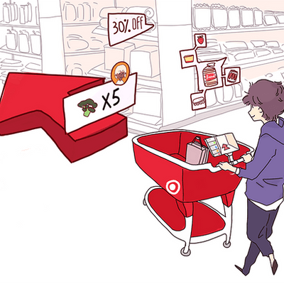
A 1% grocery share Target wanted to grow.
- Of Target's annual revenue, from grocery
- 20%
- Of shoppers add at least one food item
- 75%
- Grocery-focused stores opened in 2019
- 130
Price and selection weren't the problem. The gap was the experience inside the aisle.
9 contextual inquiries, alongside shoppers on a real run.
The brief was open: improve Target's in-store experience. Research narrowed it to groceries, in the middle of the visit.
- Contextual inquiries, mixed ages and habits
- 9
- Models: day-in-the-life, identity, sequence
- 3
- Observations on the affinity wall
- ~150
Affinity wall
The visit broke at the list, the shelf, the label and the line.
The list breaks at the door
Lists came from a notes app, a partner's text and memory. Mid-aisle: what was the third thing?
Wayfinding fails at human scale
Eye-level products got picked. Below-knee products got skipped, even when they were on the list.
Comparing takes the whole aisle
Every brand lays out the label differently, so shoppers picked up, squinted and put back.
The line is the last impression
Staffed and self-checkout queues drew the most frustration. The visit ended on its slowest part.
The tablet goes on the cart, where the shopper already is.
Considered
Kiosks, the Target app, in-aisle voice.
Kiosks stay at the door. Phones rarely come out with one hand on the cart. Voice failed on privacy and store noise.
Chose
An on-cart tablet.
It connects to the list, maps the store, scans products and ends the visit without a queue.
Five steps: build the list, load the cart, find, compare, walk out.
Build the list together
1 of 5QR onto the cart
2 of 5Navigate by aisle
3 of 5Compare in place
4 of 5Walk out
5 of 5Scan always adds to the cart. Product info gets its own surface.
Concept testing showed shoppers expected a scan to add the item or show its info, depending on the moment.
Ask after each scan
Rejected. An extra tap on the primary action, across a 40-item shop.
Branch on what's on the list
Rejected. Shoppers couldn't predict what would happen, and didn't trust it.
Separate the actions
Shipped. Scan always adds; check info is its own deliberate flow.
A concept built on nine real shopping runs.
- Contextual inquiries, run in the aisle
- 9
- Observations, clustered into five frictions
- ~150
- Target's share of the US grocery market
- 1%
Research that earned the design.
The aisle earned the design
Most design decisions traced back to a moment from watching nine shoppers mid-run.
I'd evaluate concepts longer
We settled on the tablet fast. The app and in-aisle voice deserved a deeper look.
Limits we named, not solved
Hardware on every cart, barcode scanning versus weight or vision detection, and hand-basket shoppers.